Home
Home
How to Launch a Website Without Stress or Technical Skills

The barrier to entry for establishing a digital presence has effectively collapsed. Gone are the days when launching a website required a deep understanding of HTML, CSS, and server-side management. Today, the conversation has shifted from "How do I code this?" to "How do I make this easy?" Making a website easy is a dual challenge: it must be easy for the creator to build and maintain, and it must be remarkably easy for the visitor to navigate and use.
Building a site that looks professional but doesn't cost a fortune or take months to develop is now the standard expectation for small business owners, bloggers, and entrepreneurs. By leveraging modern tools and focusing on core user experience principles, anyone can bridge the gap between an idea and a live, functional URL.
The Evolution of Website Creation from Code to Click
A decade ago, a "simple" website still required a developer to set up hosting via FTP, configure a database, and manually tweak PHP files. If you wanted to change a photo or update a paragraph of text, you often had to wait for a technician to handle the request. This friction kept many great ideas off the internet.
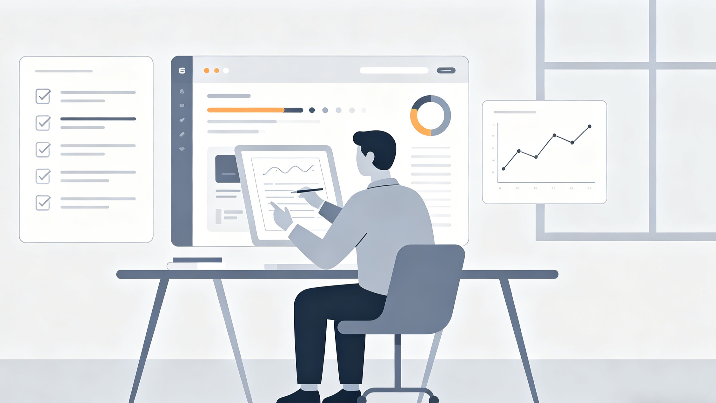
The current landscape is dominated by "No-Code" and "Low-Code" movements. Modern platforms have abstracted the complexity of web development into visual interfaces. This means that when you move a button on your screen, the software writes the underlying code for you in real-time. This shift has democratized the web, allowing the focus to return to what actually matters: content, brand identity, and customer conversion.
In our experience assisting small brands with their digital transition, the biggest psychological hurdle isn't the technology itself—it's the paradox of choice. With so many "easy" tools available, the difficulty lies in selecting the one that won't become a bottleneck as your project grows.
Choosing the Right Platform for a Hassle-Free Start
To make the process easy, you must first choose the right vehicle. There are two primary paths: Website Builders and Content Management Systems (CMS).
Drag-and-Drop Website Builders
For absolute beginners, dedicated website builders like Wix, Squarespace, and Shopify are the gold standard for ease of use. These are all-in-one solutions that include hosting, domain registration, and security (SSL) in a single monthly subscription.
- Wix: In our testing, Wix offers the most creative freedom. Their drag-and-drop editor allows you to place elements literally anywhere on the page. However, this flexibility can sometimes lead to messy layouts if you aren't careful. For those in a massive hurry, their AI builder can generate a functional site just by answering a few questions about your business.
- Squarespace: This platform is the go-to for visual-heavy sites like portfolios or photography blogs. While the editor is slightly more structured (on a grid system) compared to Wix, this "constraint" actually makes it easier to keep the site looking professional. It’s harder to "break" a Squarespace design.
- Shopify: If the primary goal of your website is selling physical or digital products, do not take the difficult route of adding a store to a blog. Start with Shopify. It is built specifically for commerce, handling taxes, shipping, and payments automatically.
Content Management Systems (CMS) for Beginners
The most famous CMS is WordPress. However, there is a crucial distinction that many beginners miss: WordPress.com vs. WordPress.org.
- WordPress.com: This is a managed service similar to Wix. It is easy to set up but offers less flexibility in the long run.
- WordPress.org: This is the self-hosted version. While it offers infinite customization, it has a steeper learning curve. You have to buy your own hosting and manage your own updates. We usually recommend this only if you plan on building a very large site or need specific features that builders can't provide.
The 5-Step Roadmap to Building Your Website Easily
Success in web creation comes down to order. Following a structured roadmap prevents the "blank page syndrome" that stalls many projects.
1. Define the Primary Objective
Before clicking a single button, ask: What is the one thing I want a visitor to do? If it’s a portfolio, the goal is "View my work." If it’s a local bakery, it’s "Find our location or order online." A website that tries to do everything usually succeeds at nothing. By narrowing your focus, you simplify the design process immediately.
2. Secure a Catchy, Short Domain
Your domain name (the .com address) is your digital storefront. To keep things easy for your customers, avoid hyphens, numbers, or clever misspellings. In our experience, the best domains are those that can be communicated over a phone call without having to spell them out. Most website builders offer a free domain for the first year, which simplifies the technical setup of "pointing" a domain to a server.
3. Select a Pre-Designed Template
Never start with a blank white screen. Professional designers have already spent thousands of hours perfecting layouts that convert. Choose a template that is 90% of what you want. You can swap out the colors, fonts, and images, but try to keep the structural layout intact. Changing a template’s fundamental structure is where beginners often get frustrated and lose the "easy" advantage.
4. Create "Minimum Viable Content"
You do not need 20 pages to launch. Most successful small websites only need four:
- Home: A clear statement of who you are and what you do.
- About: The story behind the brand to build trust.
- Services/Products: What you are offering.
- Contact: How people can reach you. Write your text in a simple document first, then copy-paste it into the builder. This keeps the technical task of "building" separate from the creative task of "writing."
5. Optimize and Publish
Before hitting the live button, check the site on your smartphone. Over 60% of web traffic is mobile. Most modern builders are "responsive," meaning they adjust automatically, but you should still verify that your buttons are large enough to be tapped by a thumb and that your text is readable without zooming.
Designing for Your Audience: Making the Website Easy to Navigate
A website is only "easy" if a visitor can find what they need in under five seconds. This is where many creators fail by over-complicating the design.
The Five-Second Rule for First Impressions
When a user lands on your homepage, they should be able to answer three questions immediately:
- Who are you?
- What do you offer?
- How do I get it? (The Call to Action).
If your "Call to Action" (like a "Book Now" button) is hidden at the bottom of a long page, you are making it hard for your customers. In our internal audits of client sites, moving a primary button to the top-right corner of the navigation bar almost always increases conversions.
The Power of White Space
Beginners often feel the urge to fill every pixel with information. This creates "cognitive load," making the visitor feel overwhelmed. White space (or negative space) isn't "empty" space; it’s a design tool that guides the eye. Use generous margins between sections. It makes your content more readable and your brand feel more high-end.
Simplified Navigation
Your menu should not be a labyrinth. Stick to a maximum of five to seven items in your main navigation. If you have more content, use a "footer" menu at the bottom of the page for secondary links like "Privacy Policy" or "Terms of Service."
Leveraging AI to Automate Content and Design
The most significant advancement in making websites easy is the integration of Artificial Intelligence. Tools like ChatGPT, Midjourney, and built-in AI assistants in platforms like Wix or Framer have removed the "content bottleneck."
- Copywriting: If you struggle with writing "About Us" pages, you can feed an AI assistant your basic business details and ask it to write a professional summary. Pro Tip: Always edit AI text to add your unique voice; otherwise, it can feel sterile.
- Visuals: High-quality photography is essential, but professional shoots are expensive. AI image generators can create custom icons or background textures that match your brand’s color palette perfectly.
- Layout Generation: Some builders now offer "Text-to-Site" features. You describe your business in a paragraph, and the AI generates the layout, picks the color scheme, and even suggests relevant images. In our tests, these are excellent starting points that save 5-10 hours of initial setup time.
Common Obstacles That Make Websites Hard to Manage
Even with the best tools, it is easy to fall into traps that make your website a headache later on.
1. Over-Installing Extensions and Plugins
If you are using WordPress, the temptation to install a plugin for every minor feature is high. However, every plugin is a piece of code that needs to be updated and can potentially crash your site or slow it down. Keep your "tech stack" lean. If a feature isn't essential to your primary goal, don't install it.
2. Neglecting Image Optimization
Uploading a 10MB photo directly from your high-resolution camera will kill your loading speed. A slow website is the opposite of an "easy" website for the user. Use online compressors to get your images under 500KB (and ideally under 100KB) without losing visible quality. Use WebP formats whenever possible for the best balance of quality and speed.
3. Forgetting About SEO Basics
Making a website easy to find is just as important as making it easy to build. You don't need to be an SEO expert, but you should ensure each page has a unique "Title Tag" and "Meta Description." Think of these as the headline and sub-headline that appear in Google search results.
Summary: The Philosophy of "Easy"
Making a website easy is about subtraction, not addition. It’s about choosing a platform that handles the technical heavy lifting, using a template that provides a professional foundation, and keeping the user interface clean and focused. By following a structured 5-step roadmap and leveraging AI where appropriate, you can move from a concept to a published website in a single weekend.
Remember the "Don't Make Me Think" rule. If you find yourself debating the placement of a minor decorative element for three hours, you are moving away from the goal. Focus on clarity over cleverness, and your website will serve as a powerful, low-maintenance asset for your brand.
FAQ
What is the cheapest way to make a website easy?
The most cost-effective way is using a free tier of a builder like Wix or Mailchimp, though these usually come with the platform’s branding in the URL (e.g., yourname.wixsite.com). For a professional look, expect to spend $12–$25 per month for a basic plan that includes your own domain.
Can I build a website on my phone?
While platforms like Wix and Shopify have apps that allow you to manage your site or make minor edits, building a full website from scratch is significantly easier on a desktop or laptop. The larger screen allows for better precision in layout and design.
How long does it actually take to make a website?
With an AI-powered builder, you can have a "Minimum Viable Product" live in under 30 minutes. However, a well-thought-out professional site typically takes between 5 to 10 hours of active work, including content writing and image selection.
Do I need to know any code at all?
No. For 95% of small business and personal use cases, you will never need to see a single line of code. Code is only necessary if you require highly specialized, custom-built functionality that isn't available in standard app marketplaces.
Is WordPress too hard for beginners?
WordPress.com is very approachable. WordPress.org (self-hosted) has a steeper learning curve because you are responsible for security and updates. If your goal is "maximum ease," we generally recommend a drag-and-drop builder over a self-hosted CMS.
-
Topic: A Step-by-Step Guide to Website Creation for Absolute Beginnershttps://www.tooltester.com/wp-content/uploads/2023/05/TT-Website-Creation-Ebook-2023.pdf
-
Topic: How to Build a Website: 2 Methods, 9 Easy Steps, & 35 Amazing Tipshttps://blog.hubspot.com/marketing/how-to-make-a-website?id=57
-
Topic: How to make a quick website — build a simple site fast & easy (with and without AI)https://www.wix.com/blog/how-to-make-a-website-fast