Home
Home
Shape in Shape: How to Master Nested Geometry in Modern Design
Visual communication is undergoing a profound shift toward structural complexity. At the center of this movement is the concept of "shape in shape"—a design technique where geometric or organic forms are nested within one another to create depth, focus, and narrative. This is not merely a decorative choice; it is a sophisticated method of organizing information and guiding human perception. As digital interfaces and branding evolve in 2026, understanding the interplay between a container and its contents has become the defining skill for visual strategists.
The psychology of containment and focus
The human brain is hardwired to look for boundaries. When we observe a shape in shape, we are participating in a fundamental cognitive process known as the "containment schema." This psychological framework allows us to distinguish between what is internal and what is external, creating an immediate sense of hierarchy.
In a crowded digital landscape, nested geometry acts as a visual anchor. By placing a specific element inside a larger geometric form, designers create a "micro-environment" that demands attention. This is why the shape in shape approach is so prevalent in call-to-action buttons, notification badges, and hero sections. The outer shape provides the context, while the inner shape provides the signal. This dual-layered communication reduces cognitive load by pre-organizing the visual field for the viewer.
Core principles of nested geometric composition
Successfully implementing a shape in shape aesthetic requires more than just placing a circle inside a square. It demands a rigorous adherence to spatial logic and visual balance. Several core principles dictate whether a nested composition feels harmonious or chaotic.
The Golden Ratio and Proportional Scaling
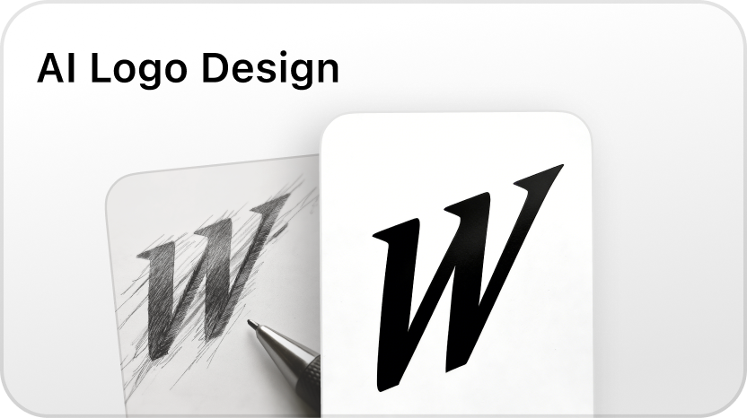
One of the most critical factors in nesting shapes is the mathematical relationship between the inner and outer forms. In 2026, the trend has moved away from arbitrary sizing toward proportional scaling based on the Golden Ratio (1.618). When the area of the inner shape maintains a specific mathematical ratio to the outer shape, the composition feels naturally stable. This is particularly evident in contemporary logo design, where the "shape in shape" technique is used to create symbols that are legible at both massive and microscopic scales.
Negative Space as a Third Shape
In high-end visual design, the space between the nested shapes is just as important as the shapes themselves. Expert designers treat negative space as a third, invisible shape. By manipulating the "padding" or "gutter" between the inner and outer boundaries, you can create tension or tranquility. A narrow gap creates a sense of high energy and precision, while a generous gap suggests luxury and breathability. The interaction of these boundaries is what gives a shape in shape composition its unique character.
The Contrast of Form
While nesting similar shapes (a circle within a circle) creates a meditative, rhythmic feel, nesting dissimilar shapes (a triangle within a circle) generates dynamic interest. This contrast of form is a powerful tool for storytelling. For instance, placing an organic, fluid shape inside a rigid, brutalist square suggests a narrative of growth within constraints or creativity within a corporate structure. This technique is widely used in editorial design and motion graphics to convey complex emotional themes without relying on text.
The evolution of shape in shape in 2026 UI/UX
User interface design has moved beyond the flat surfaces of the previous decade. Today, the shape in shape concept is utilized to solve complex navigation and functional problems in spatial computing and responsive web environments.
Adaptive Containers
In 2026, we are seeing the rise of "smart containers"—outer shapes that dynamically adjust their geometry based on the data contained within the inner shape. This fluidity represents a more mature version of responsive design. Instead of a simple grid, the layout uses a nested logic where the relationship between shapes remains constant even as the screen dimensions shift. This ensures that the visual hierarchy is never compromised, regardless of the device.
Depth Perception and Layering
Modern interfaces use the shape in shape technique to simulate three-dimensional depth without the need for heavy skeuomorphism. By using subtle gradients, blurs, and offset shadows on nested elements, designers can create a sense of "stacking." The outer shape acts as a frame or a window, while the inner shape appears to float at a different Z-index. This clarity is essential for complex software where users must manage multiple streams of information simultaneously.
Technical implementation: from SVG to CSS
Implementing a complex shape in shape design requires a deep understanding of modern web standards. While designers often start in vector software, the translation to the live environment is where the magic happens.
Clipping and Masking
Clipping paths and CSS masks are the primary tools for achieving the shape in shape effect on the web. A clip-path allows you to define a specific area of an element to be visible, effectively creating a shape. When you nest an element with one clip-path inside a container with another, you create a layered geometric effect that is both lightweight and infinitely scalable. This method is preferred over using static images because it preserves accessibility and allows for real-time manipulation via JavaScript.
SVG Nesting and Animation
Scalable Vector Graphics (SVG) offer the most precise control over nested geometry. By nesting <g> (group) tags or using <use> elements, developers can build intricate patterns where the inner shapes inherit properties from the outer shapes. In 2026, motion designers are increasingly using this structure to create "morphing" animations, where the inner shape in shape transitions into a completely different geometric configuration during user interaction. This provides high-quality visual feedback that feels organic and responsive.
Design trends: what is driving the "Shape in Shape" aesthetic?
Several cultural and technological shifts have converged to make nested geometry the dominant visual language of the current era.
- The New Minimalism: Unlike the "empty" minimalism of the early 2020s, the new minimalism focuses on density and structural integrity. A single shape in shape icon can replace a paragraph of text, providing a cleaner look that doesn't sacrifice meaning.
- Generative Geometry: AI-driven design tools are now capable of generating thousands of nested variations based on a few initial parameters. This has led to a surge in complex, fractal-like patterns that were previously too time-consuming to create manually.
- Sustainability in Branding: Many brands are adopting the shape in shape approach to create versatile logos that work across all mediums. By nesting their primary mark within a consistent container, they ensure brand recognition even in low-resolution or monochromatic environments.
Common pitfalls to avoid
While the shape in shape technique is powerful, it is easy to overcomplicate. Here are the most common mistakes to watch out for:
- Over-nesting: Adding too many layers (a shape in a shape in a shape) can lead to visual clutter. Usually, three levels of nesting is the limit for clear communication.
- Poor Contrast: If the color or texture of the inner shape is too similar to the outer shape, the "nesting" effect is lost, and the design looks like a single, muddy object.
- Ignoring Legibility: In typography and iconography, the outer shape must never interfere with the recognizable silhouette of the inner form. If the container makes it hard to read the content, it has failed its purpose.
- Inconsistent Corner Radii: When nesting rounded rectangles, the corner radius of the inner shape should be smaller than that of the outer shape to maintain a visually consistent "tunnel" effect. Ignoring this mathematical reality is a hallmark of amateur design.
The strategic decision: when to nest
Choosing to use a shape in shape composition should be a strategic decision based on the goals of the project. It is most effective when you need to:
- Group disparate elements: An outer shape can unify several smaller, different shapes into a single cohesive unit.
- Highlight a specific action: A nested shape creates a natural target for the eye, making it perfect for UI interactions.
- Convey a brand story: Nesting can symbolize protection, inclusion, or the relationship between a core product and its ecosystem.
For projects that require extreme simplicity or raw, unfiltered messaging, a single, bold shape may be more effective. However, for almost any modern application requiring depth and hierarchy, the shape in shape method remains an indispensable tool in the designer's arsenal.
Conclusion
The "shape in shape" phenomenon is more than just a passing trend; it is a reflection of our desire for order and meaning within complexity. By mastering the mathematical, psychological, and technical aspects of nested geometry, creators can build visual systems that are not only beautiful but also deeply functional. As we look toward the future of digital and physical design, the ability to manipulate the relationship between container and content will remain a cornerstone of effective visual communication. Whether you are designing a brand identity, a mobile app, or a large-scale architectural installation, remember that the most powerful stories are often told through the simple, elegant interaction of one form living within another.
-
Topic: Znaczenie SHAPE, definicja w Cambridge English Dictionaryhttps://dictionary.cambridge.org/pl/dictionary/english/shape?q=shape_2
-
Topic: shape noun - Definition, pictures, pronunciation and usage notes | Oxford Advanced Learner's Dictionary at OxfordLearnersDictionaries.comhttps://www.oxfordlearnersdictionaries.com/us/definition/english/shape_1
-
Topic: shapeの意味|大きさ・程度|TOEFL・TOEIC・英検なら eigonaryhttps://m.eigonary.com/e/5760